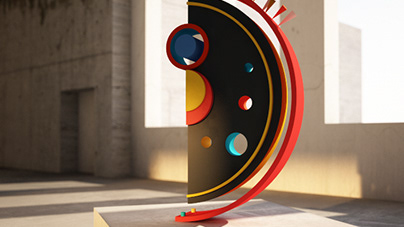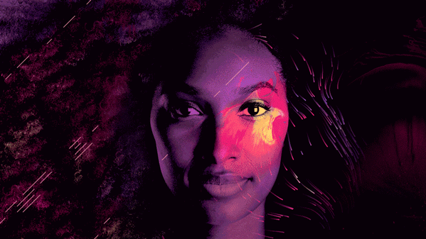
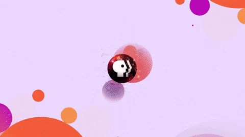
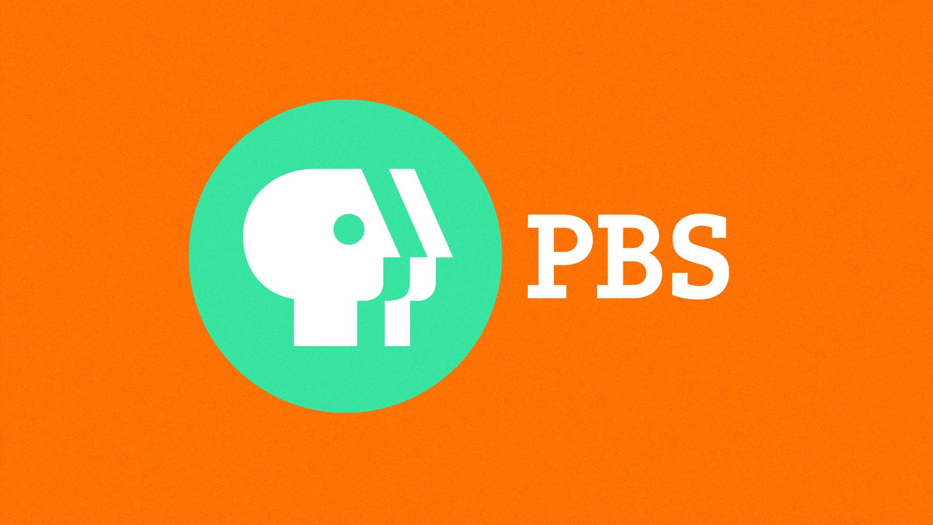
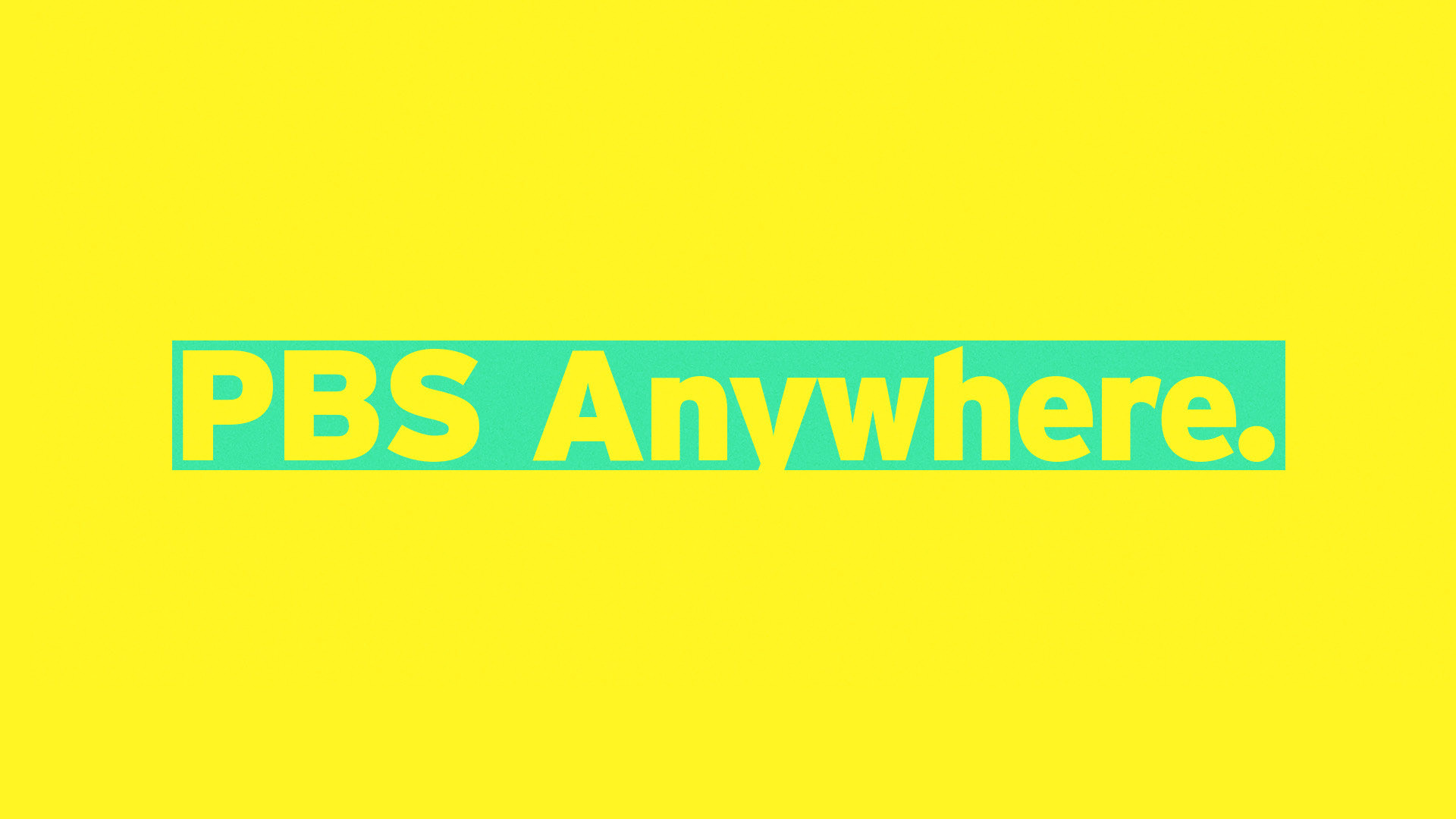
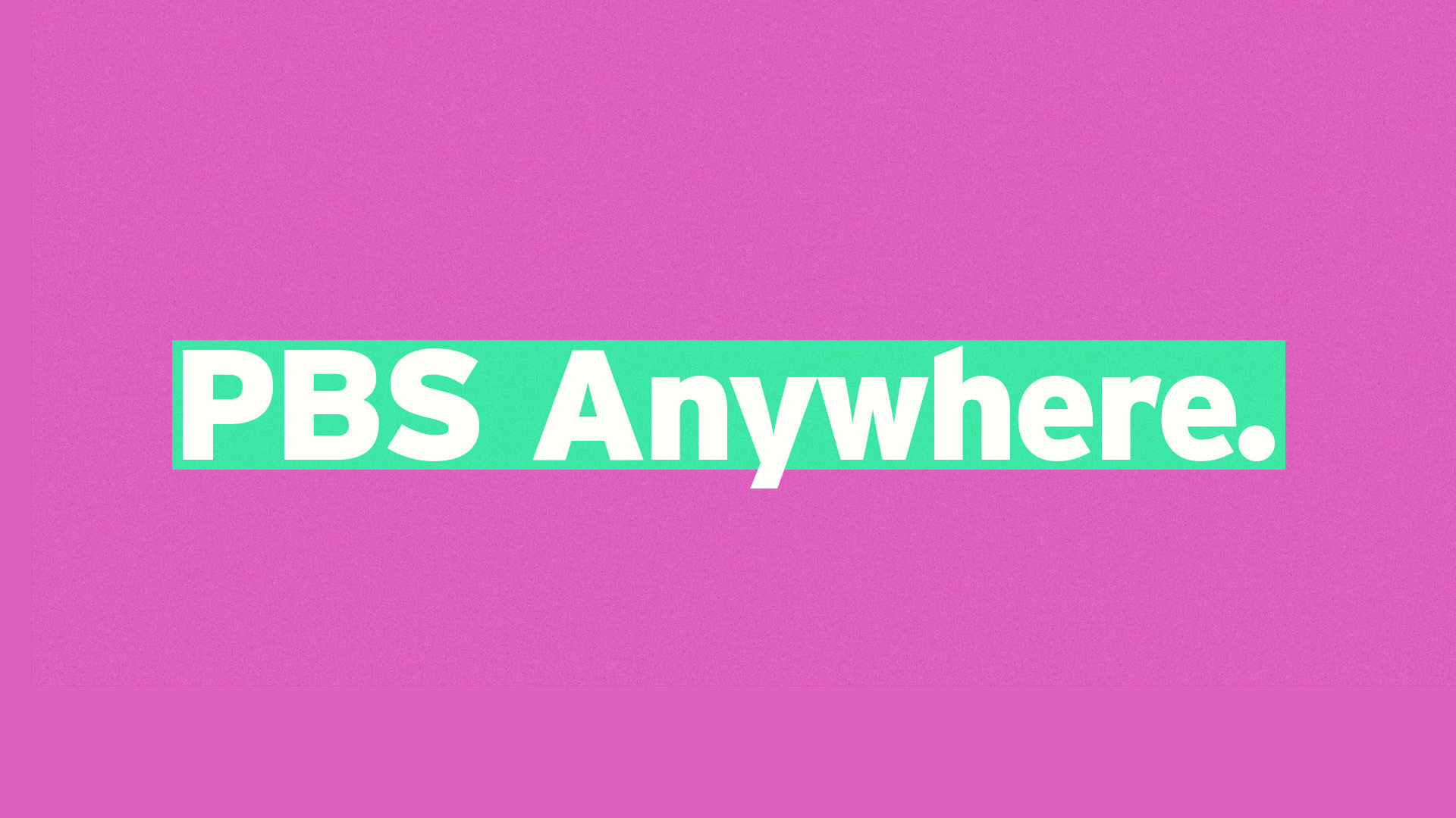
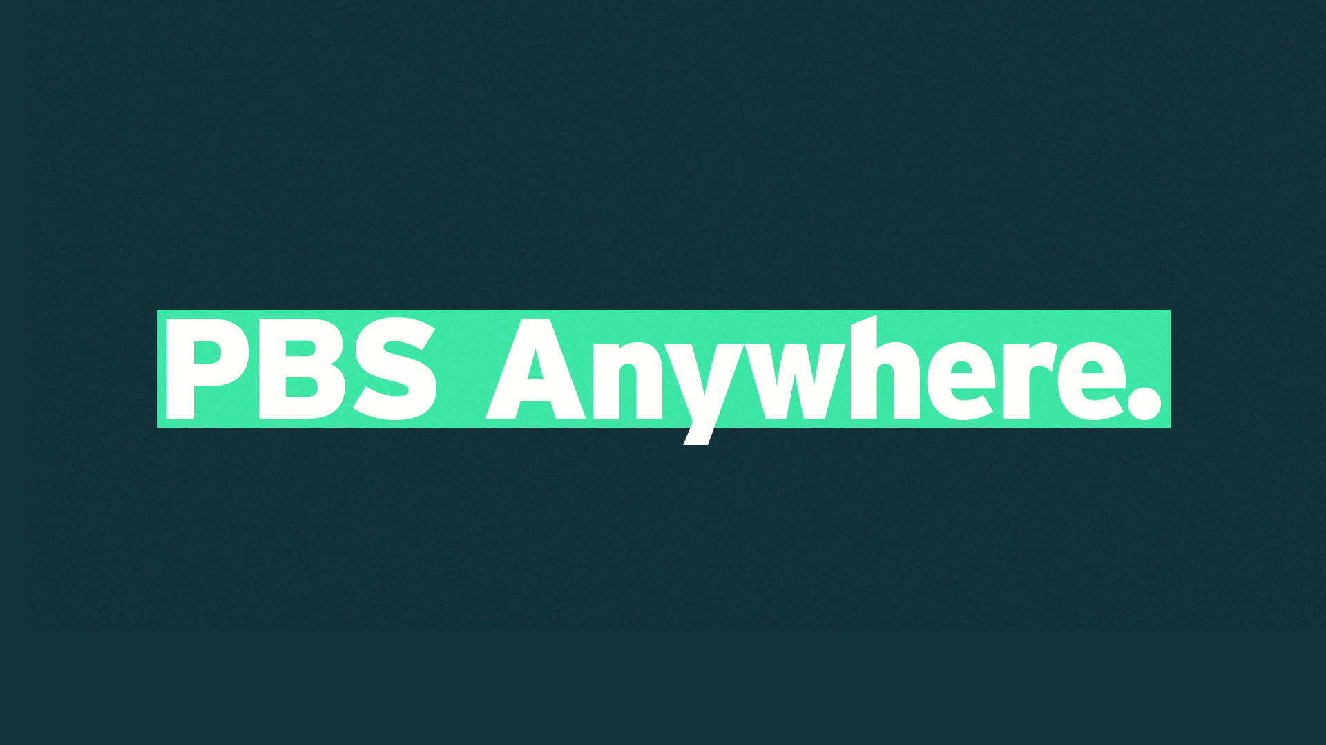
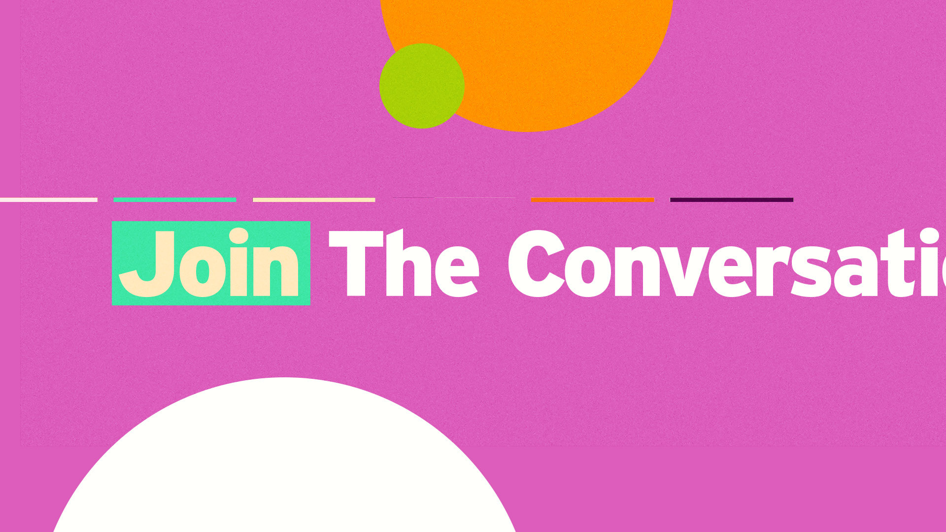
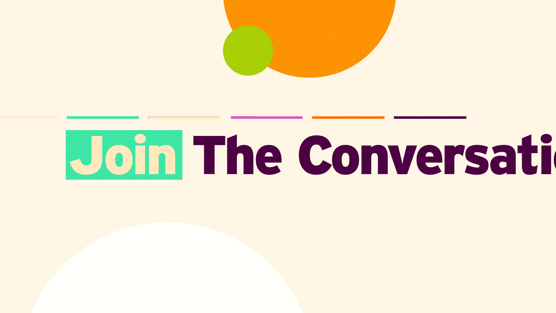
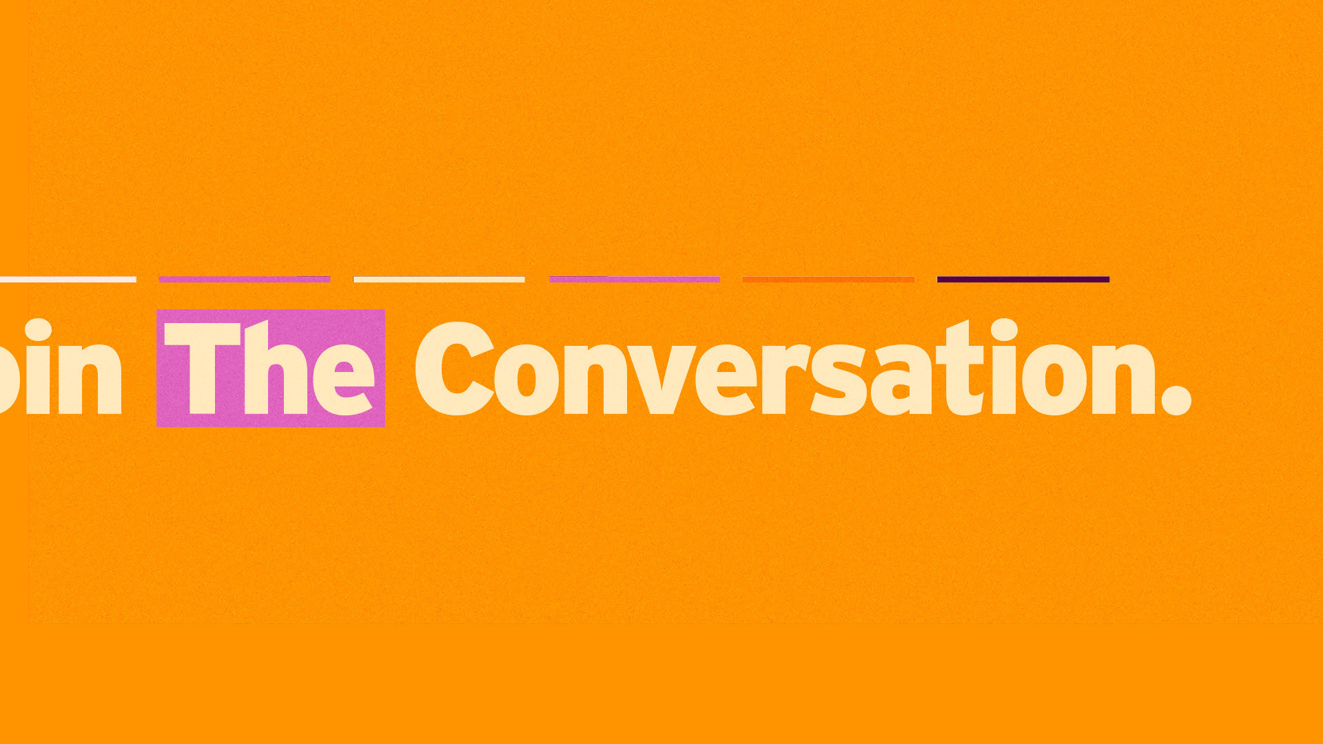
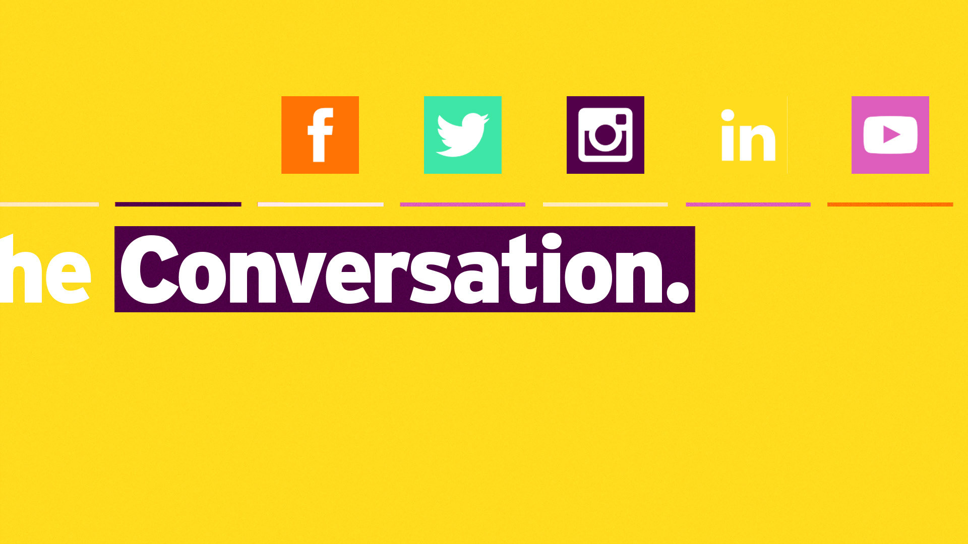
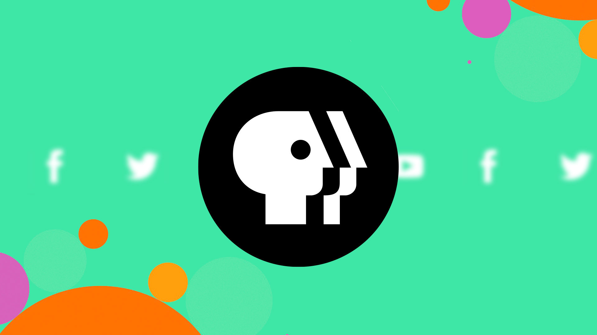
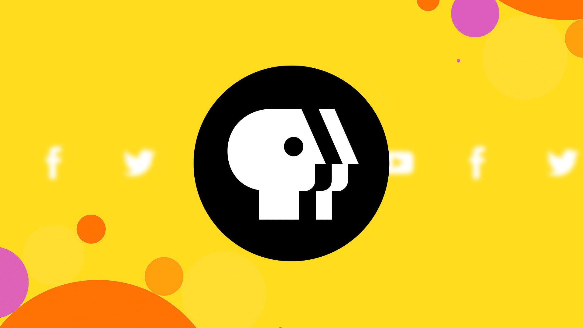
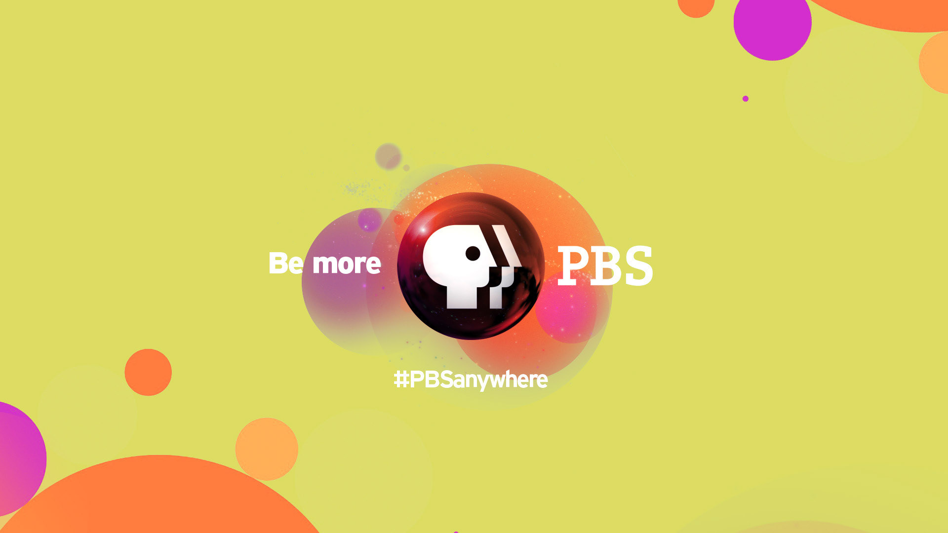
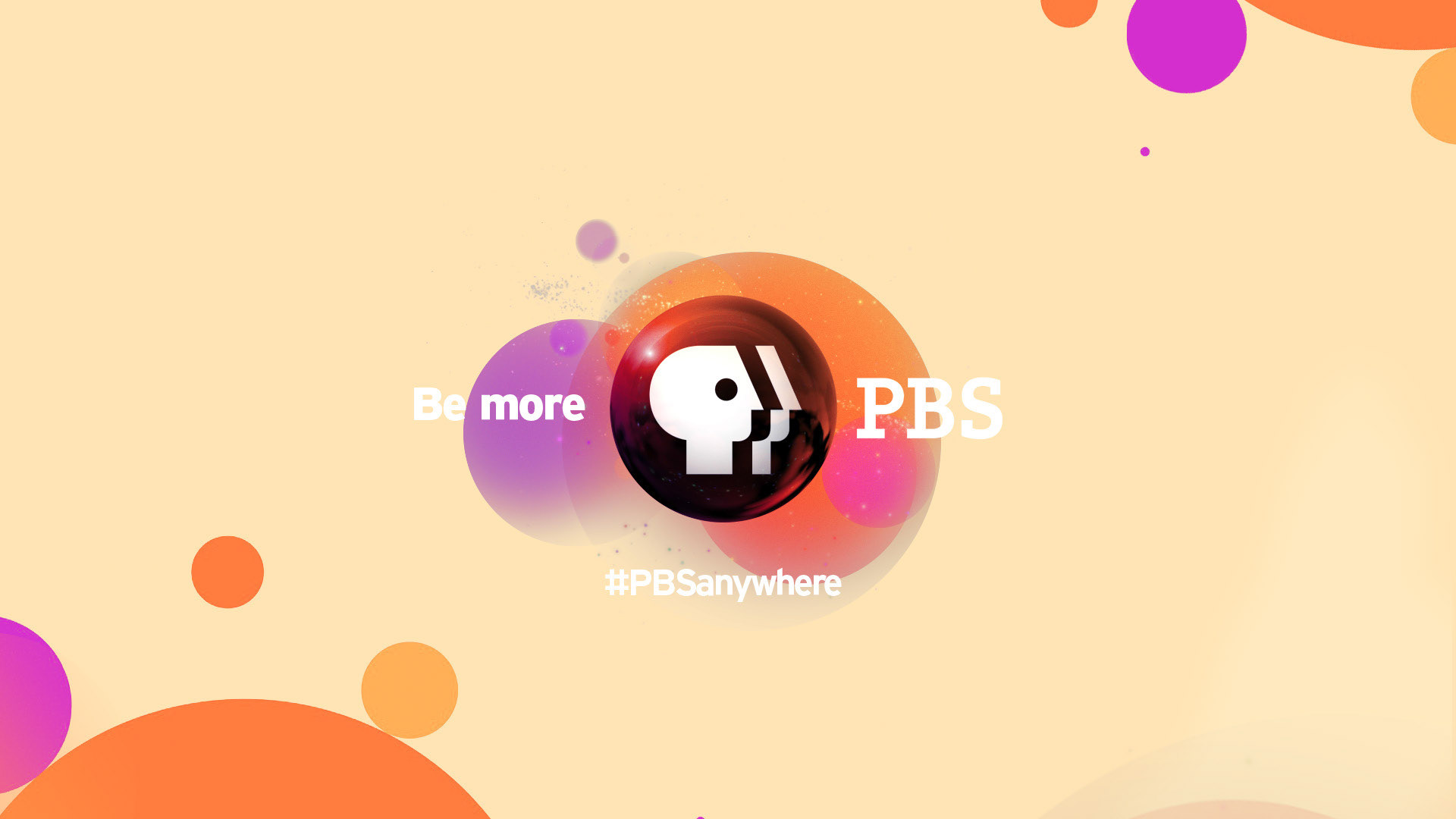
Design 1: Color Pop
A modern take of the bubbles idea that emphasize on the brand elements; reflecting a good variety of brand colors and a bold & accessible typographic usage. Tone: Friendly, Fresh & Accessible
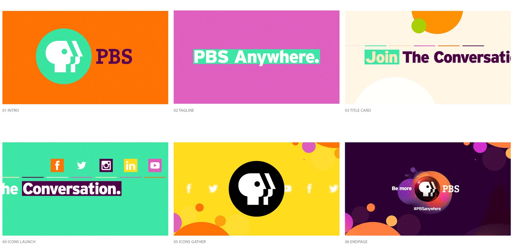


Intro


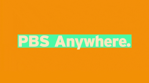
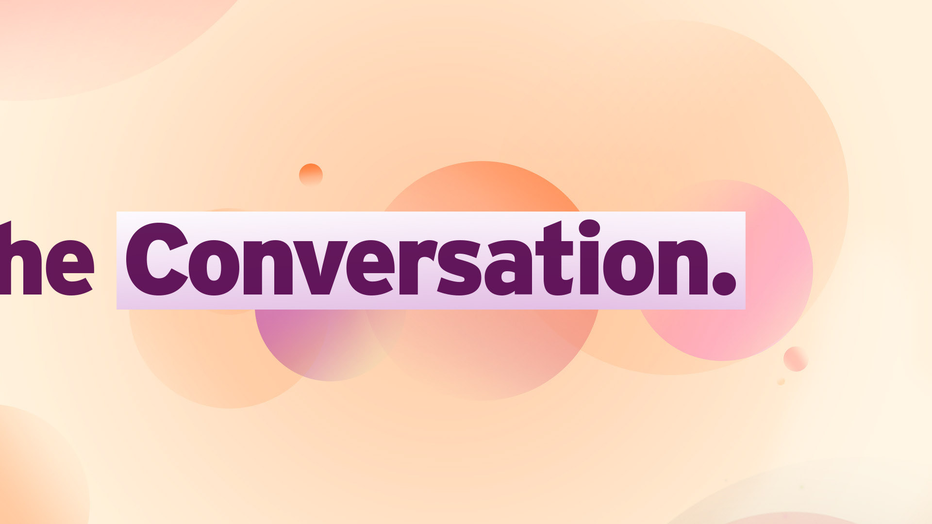
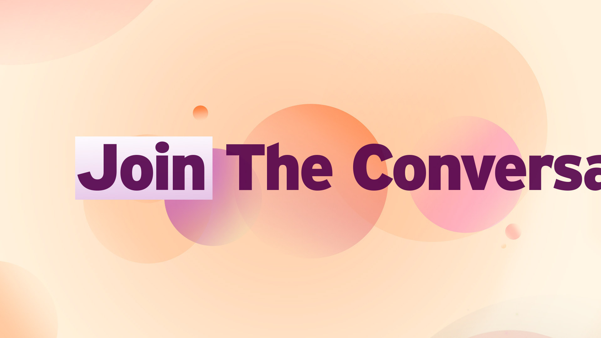
Tagline
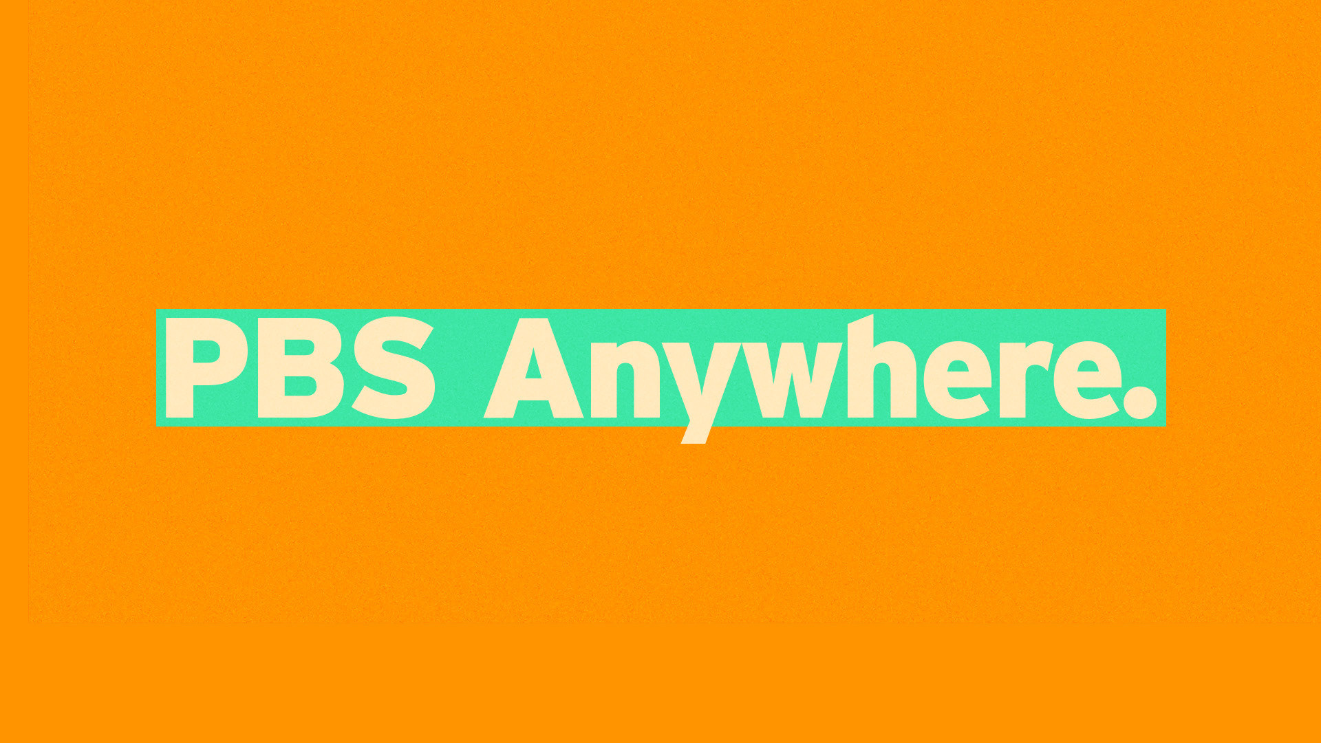
Titlecard
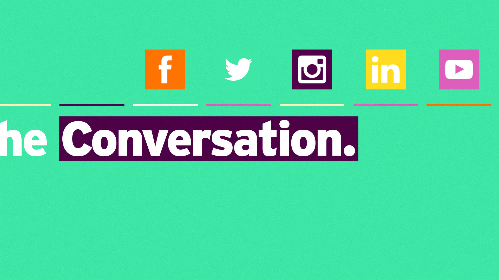
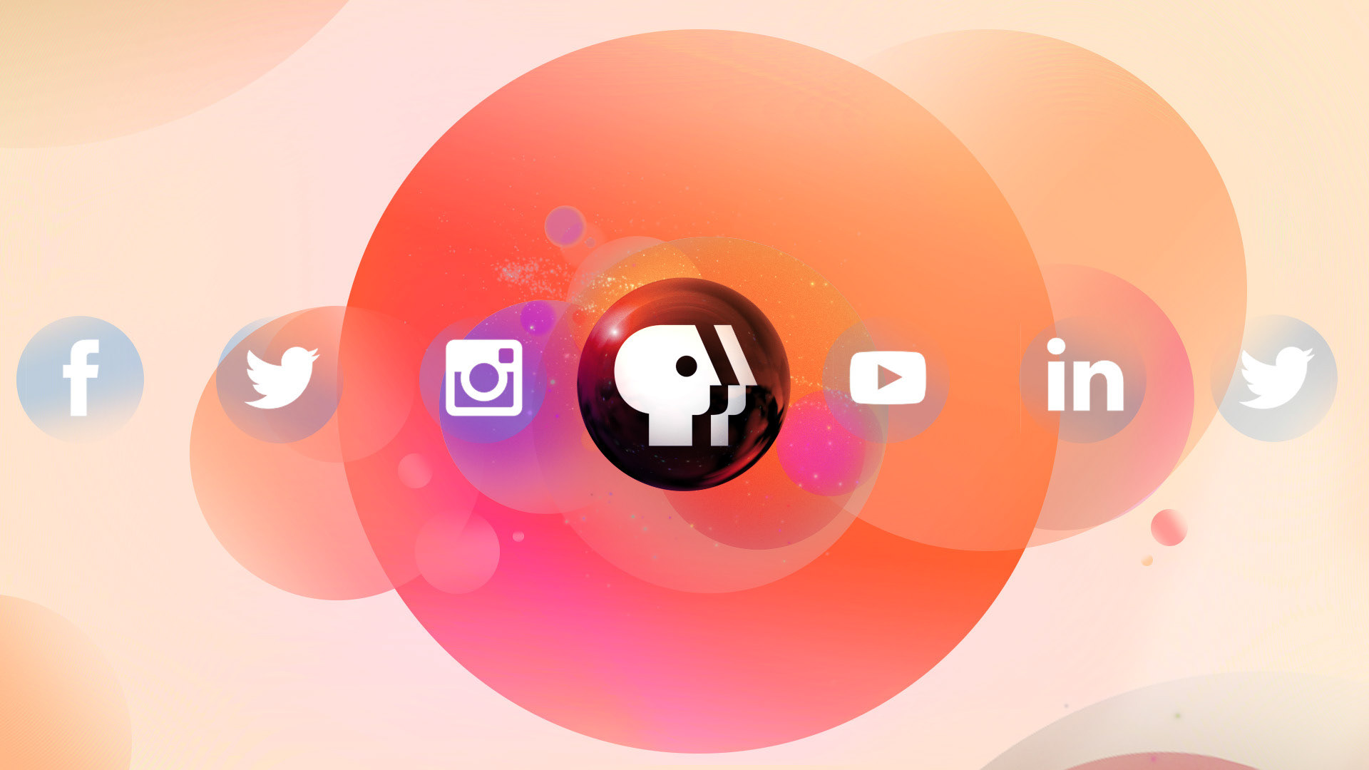
Icons Launch

Icons Gather


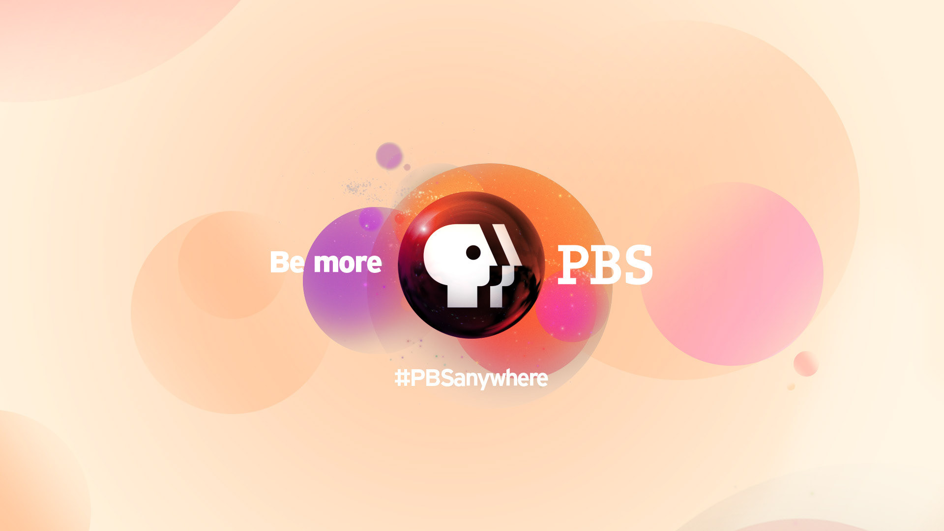
Endpage
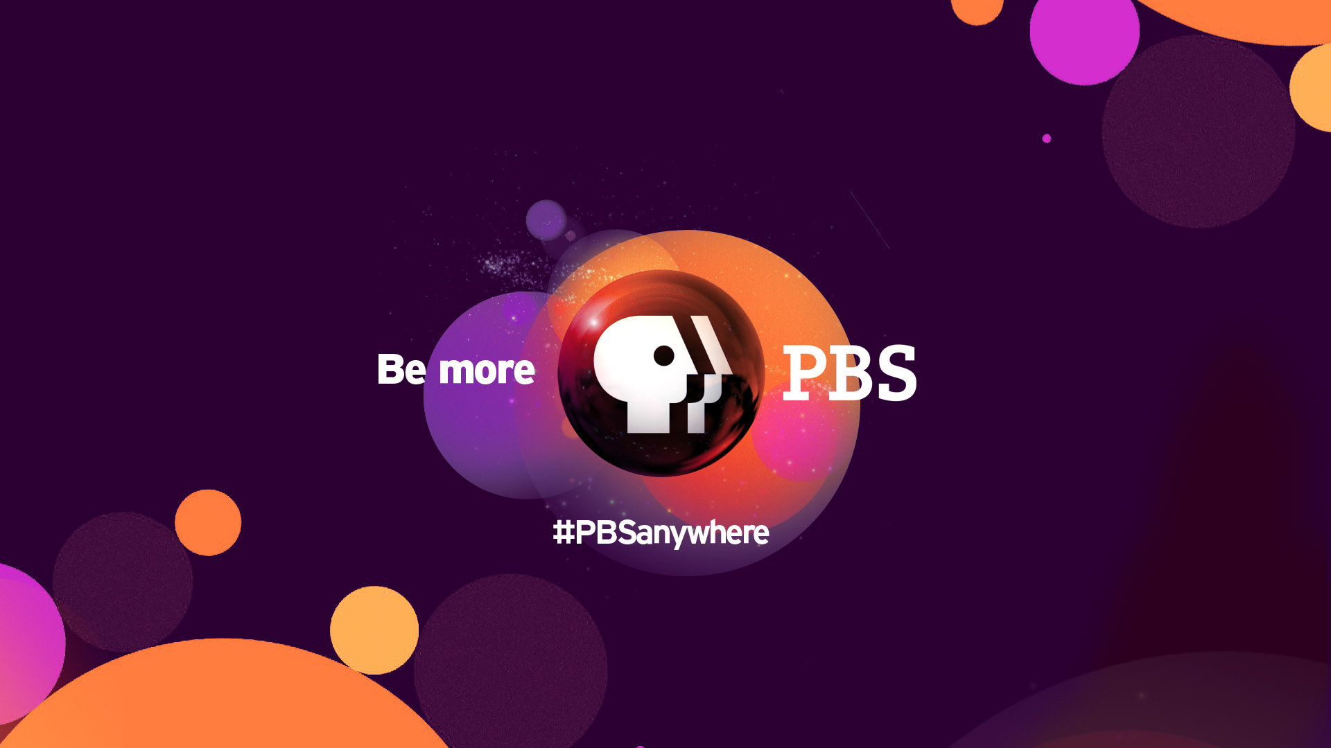
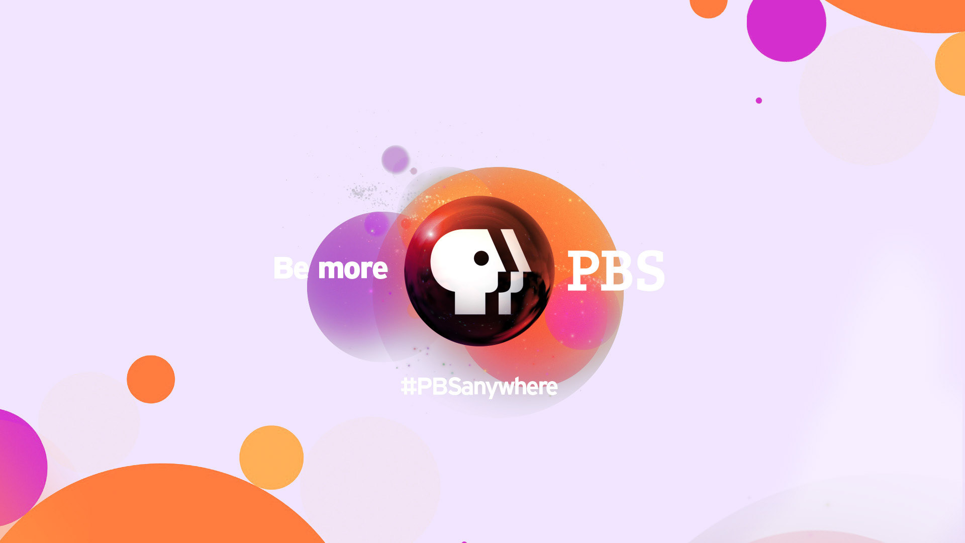
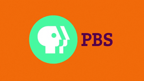
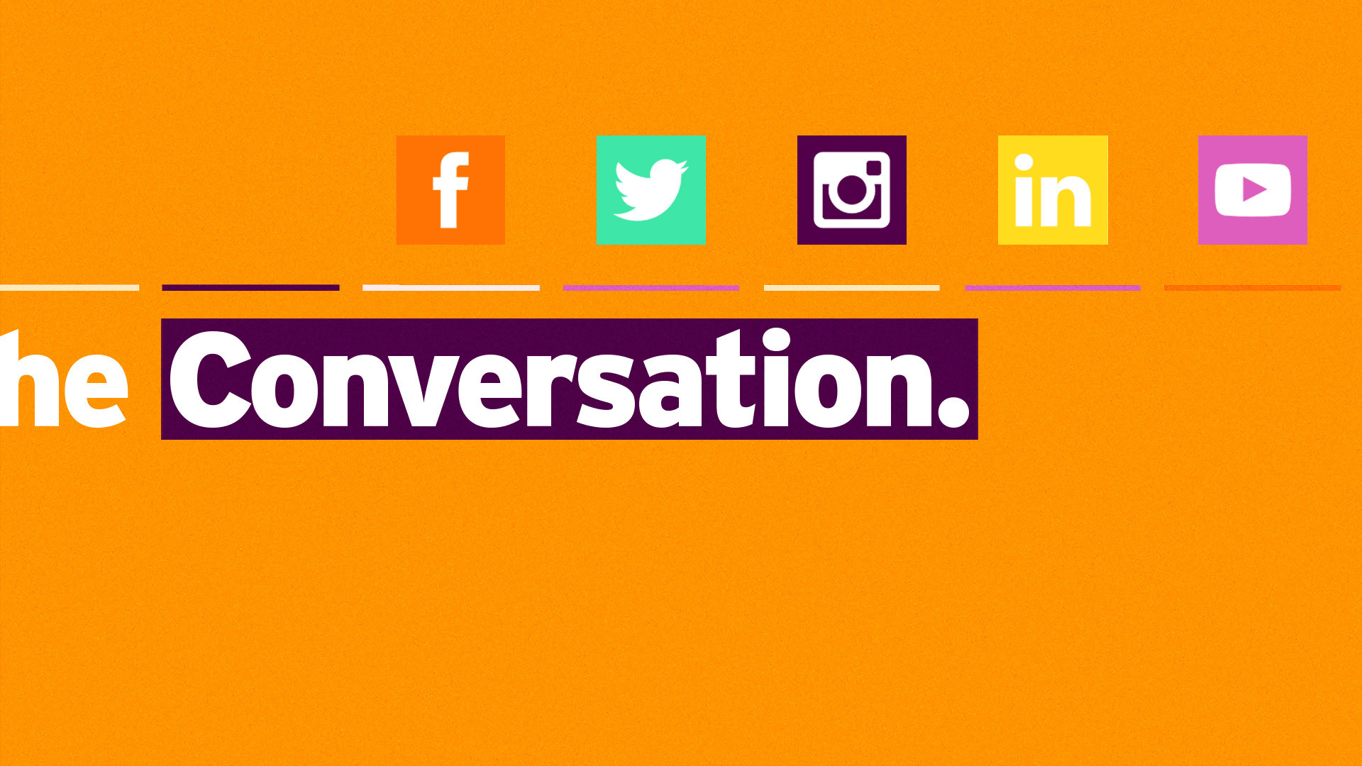
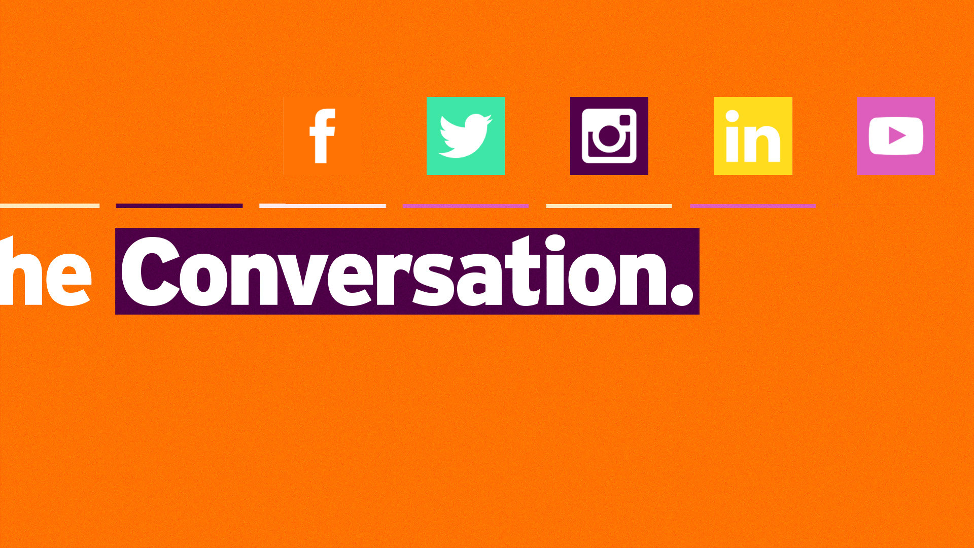
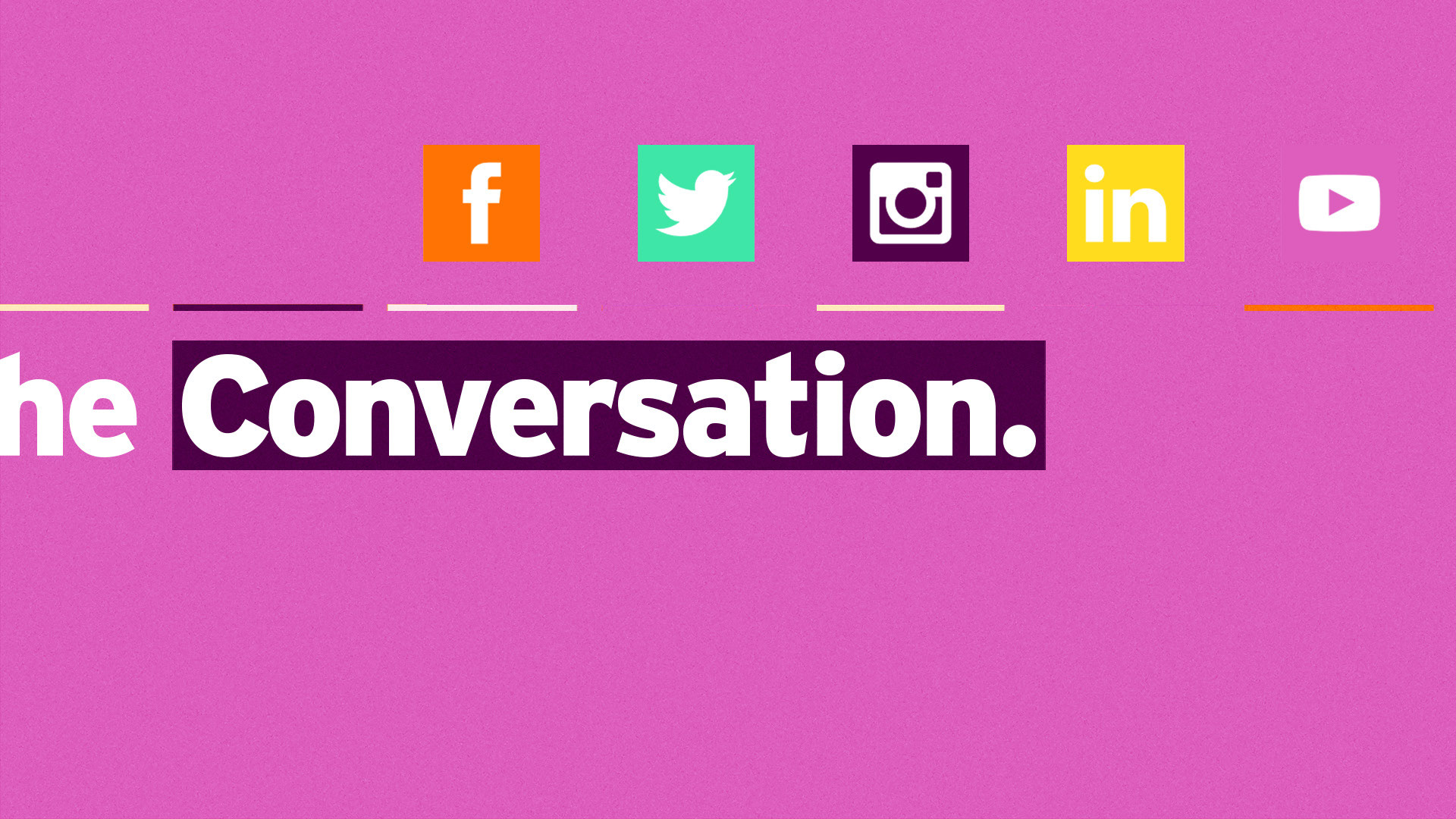
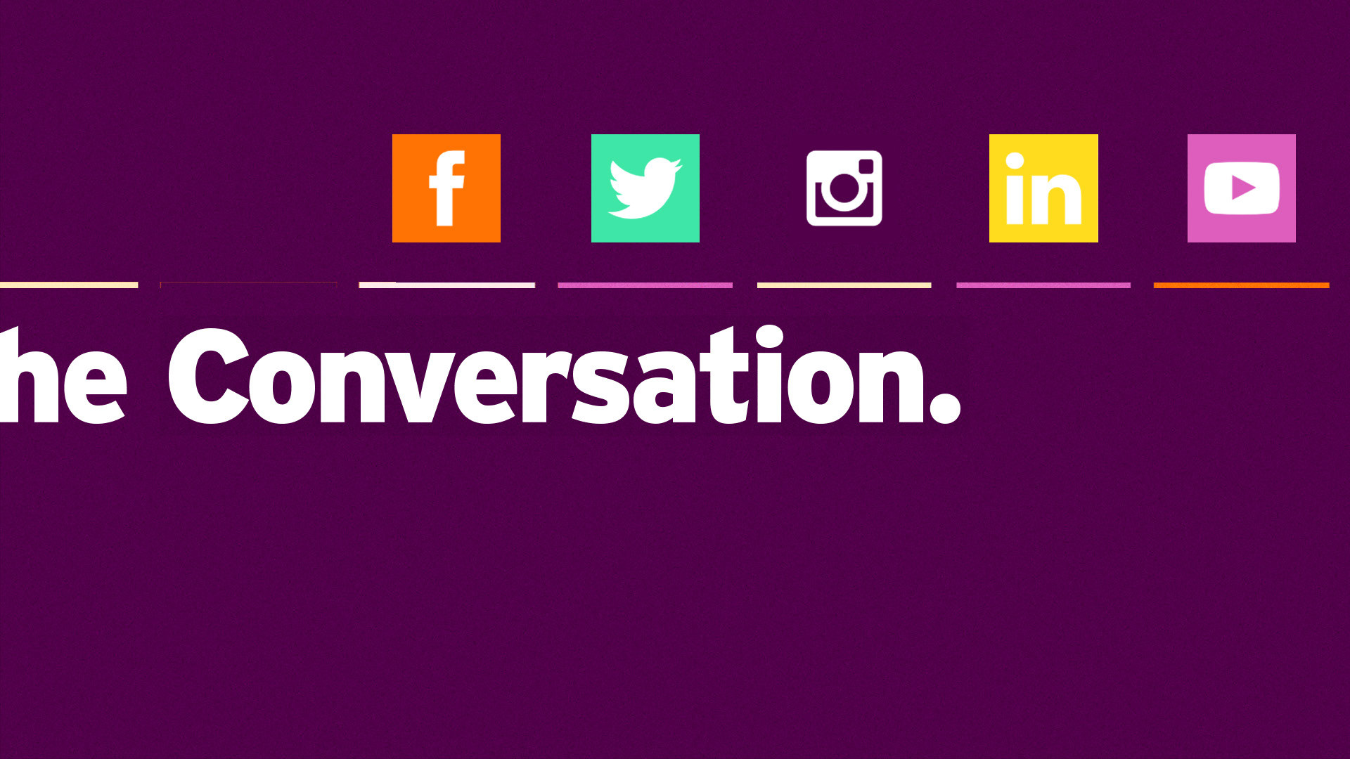
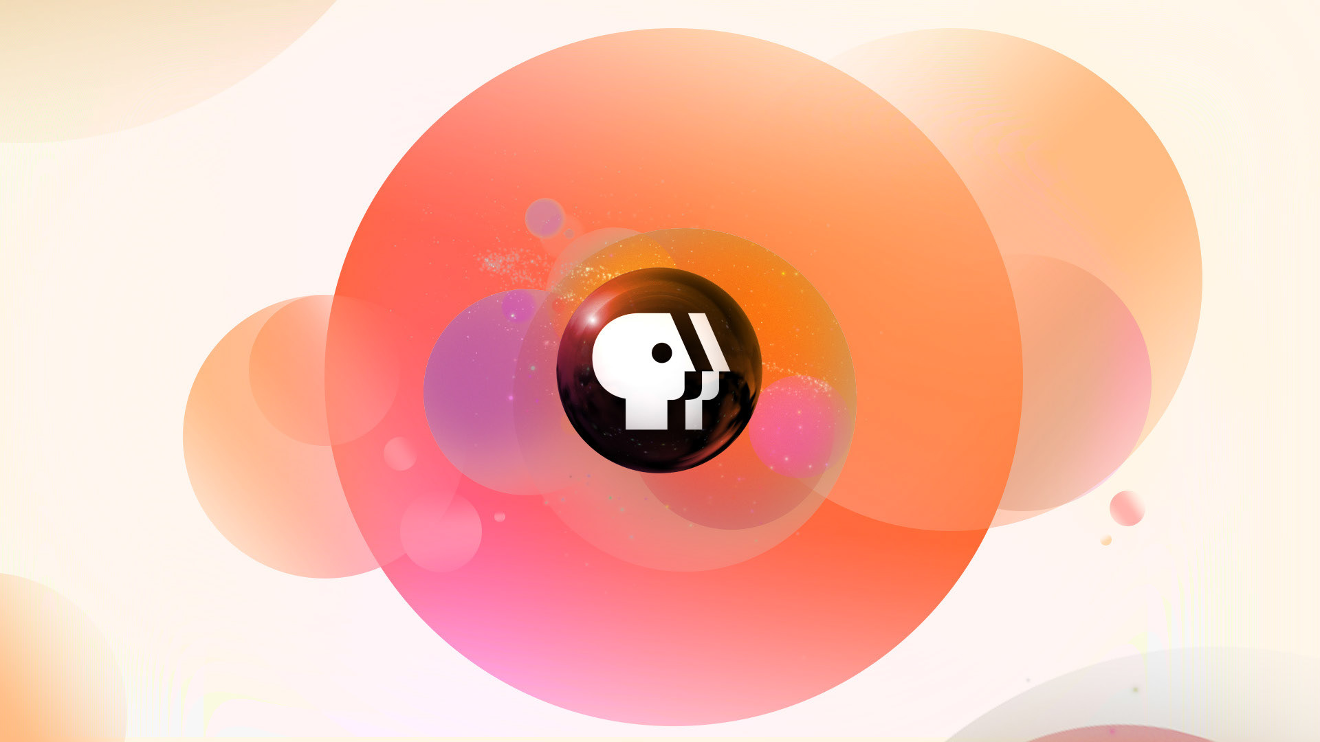
Design 2: Segments
Utilizing the layers of the logo that overlap and build to the PBS mark on a lighter background within the “orange” color scheme, we introduce the social media bumpers in a clean fashion as sliding row (ie. smartphone interfaces). The typography is bold and distinctive that dials into a refreshed take of the current brand identity.
Tone: Bright, Accessible & Present


Thank you